Psychology of Cancellation
Cancellation is one of the most common—and emotionally loaded—flows in any subscription product. I led a usability-driven redesign of the plan change and cancellation experience to understand how visibility, language, and sequencing affect user trust and behavior. Through testing multiple design approaches, we learned how to reduce impulsive churn without hiding exits—reframing cancellation as a moment of clarity, care, and learning for both users and the business.
ROLE
PROBLEM
Cancellation UI either pushed impulsive churn (too visible) or hurt trust (too hidden). We needed a flow that felt honest and supportive while still improving retention.
RESULTS
Don’t hide cancellation—hidden exits kill trust.
Honest bias is fine; misleading framing isn’t.
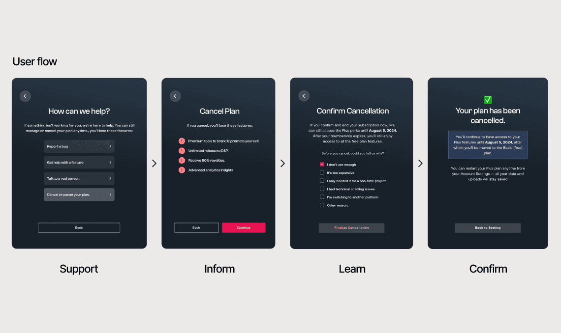
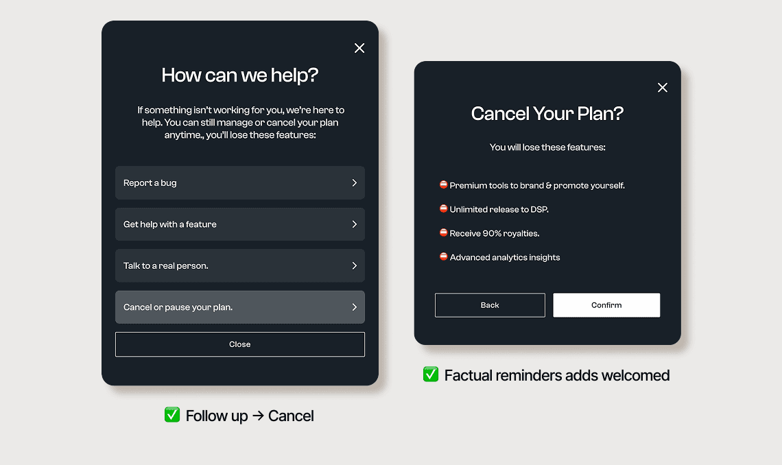
Lead with “Get help” before “Cancel” to show care.
Treat cancellation as feedback—capture the reason and learn fast.
Cancellation isn’t failure—it’s signal
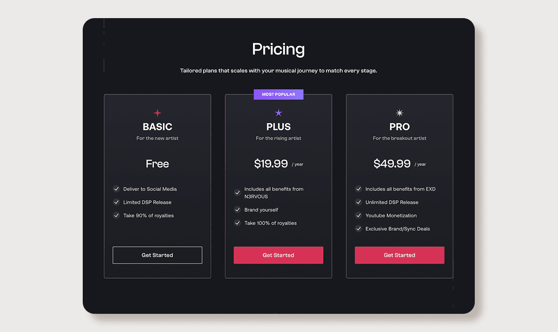
We were gearing up for a beta launch with three plans—Basic, Plus, and Pro—when the team floated a familiar growth tactic: hide downgrade/cancel to reduce churn. But as a small startup, churn isn’t just loss—it’s data. Cancellation is one of the clearest moments to learn what’s broken, what’s missing, and what users truly value. So the goal wasn’t to block exits. It was to give users real control while building trust—designing a plan-change flow that feels generous and honest, captures feedback, and still encourages retention the right way.
Testing the balance
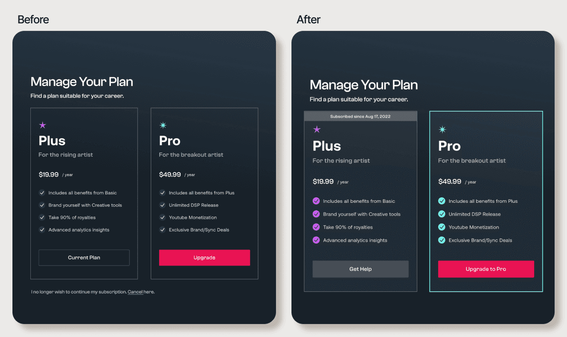
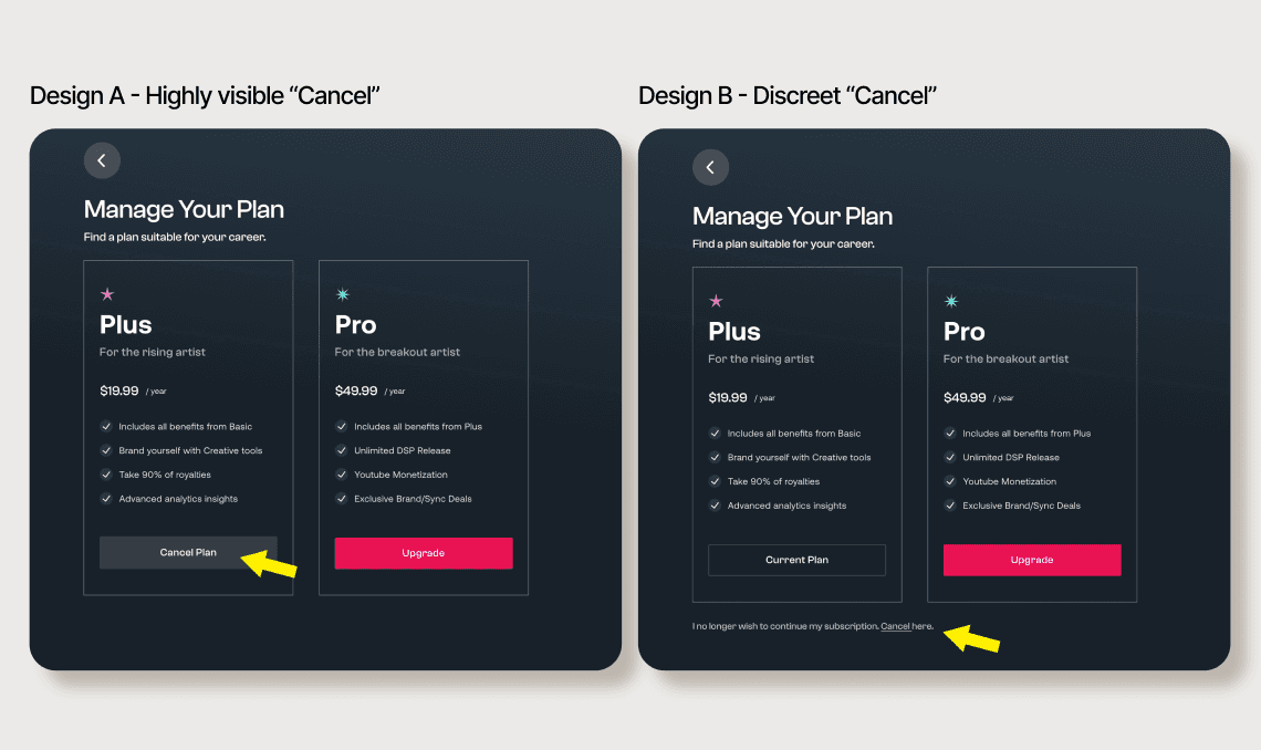
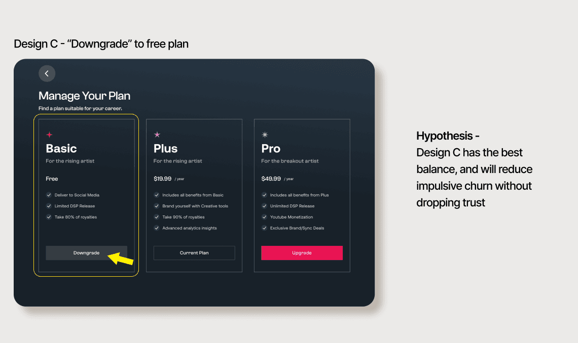
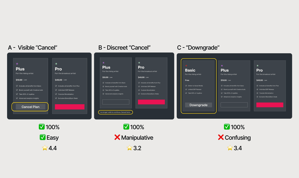
To move beyond assumptions, I ran a usability test with three plan-change designs that varied in cancellation visibility. A made “Cancel plan” highly visible, B hid it behind secondary text, and C introduced a Free tier as a downgrade option. The hypothesis was that a middle ground would reduce impulsive churn without hurting trust. All three designs achieved full task success, but the learning was clear: users valued clarity over concealment. Hiding cancellation damaged trust, while leading with “Cancel” felt indifferent. The insight shifted the solution toward reframing—not hiding—the exit.
What users told us—beyond cancellation
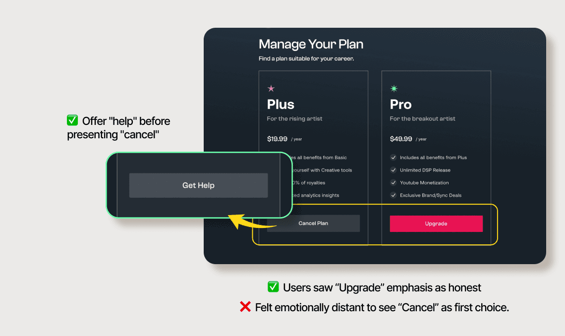
Beyond task completion, users gave strong emotional feedback. They were comfortable with “honest bias”—making upgrades and higher-tier plans more prominent—because the intent felt clear. What they flagged was showing “Cancel” upfront, before they’d even expressed a problem. It planted the idea of leaving and made the product feel distant. Shifting the primary action to “Get help” set the right tone first—support, then exit—while keeping cancellation easy to find when needed.
Clarity for users—and for us
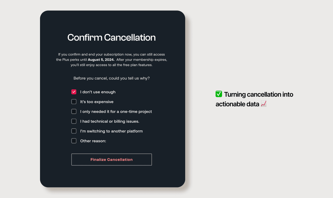
Users wanted a clear, factual reminder of what changes when they cancel. It read as fairness—not a dark pattern—but it also worked as a healthy friction point that reduced impulsive exits. We also made the exit survey required, treating every cancellation as high-signal data to improve the product.
Trust is built at the exit
This project showed that cancellation isn’t just a churn problem—it’s a trust moment. By leading with help, keeping exits honest, and being clear about consequences, we gave users control without pushing them away. In the process, cancellation became a source of clarity and learning, helping the product improve while reinforcing a relationship built on transparency rather than friction.